 Skip to content


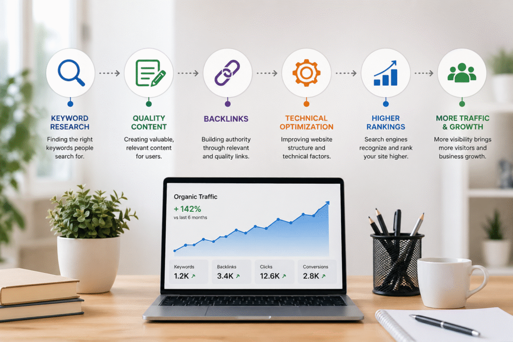
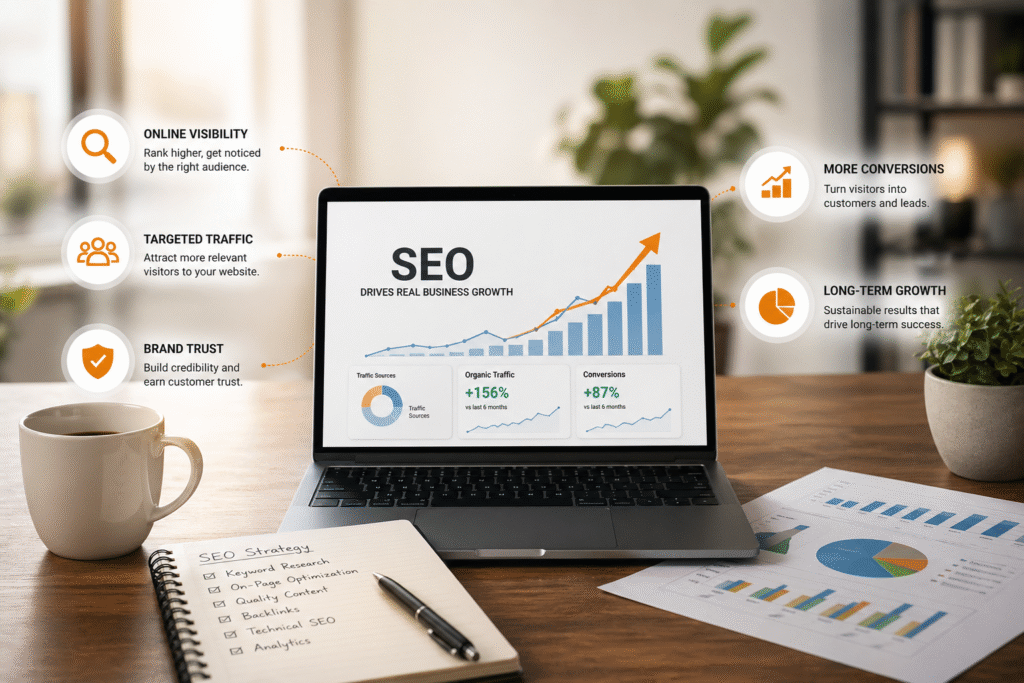
Data-Driven Design
We will be able to analyze user behavior and device usage to design in a manner that will optimize engagement, usability, and overall performance.
Adaptive Frameworks
Modern frameworks guarantee scalability, flexibility and quicker development of responsive and high-performance websites.
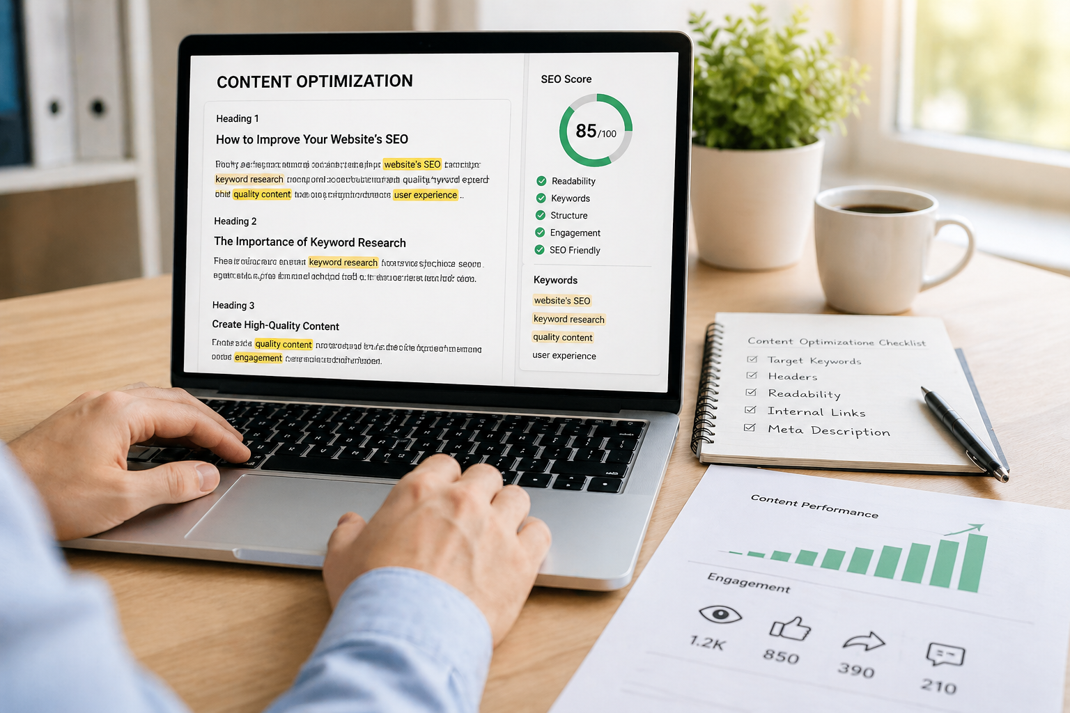
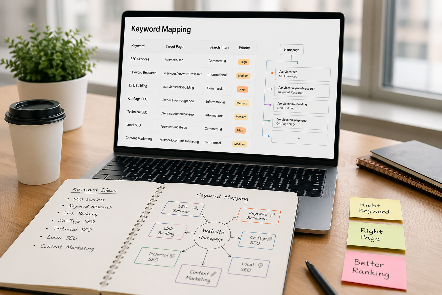
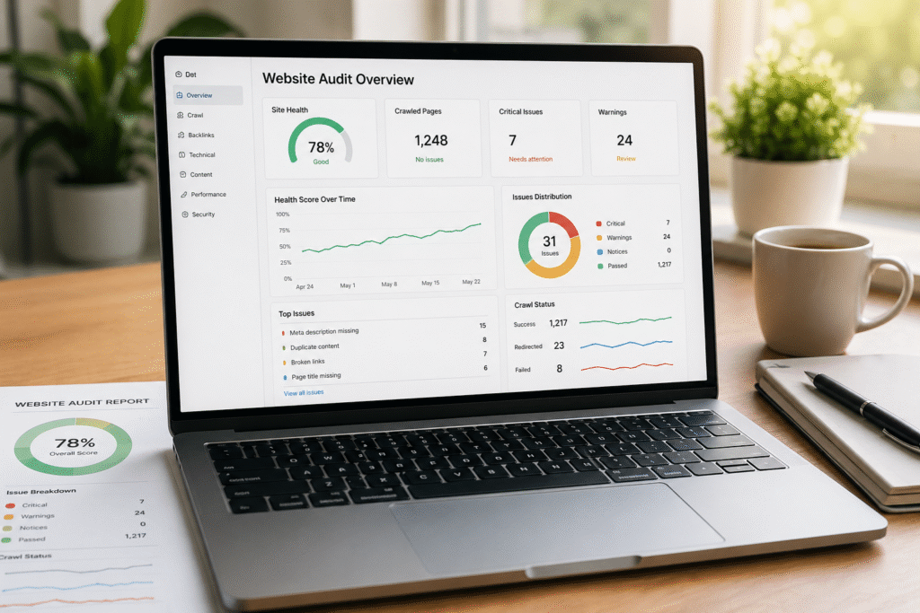
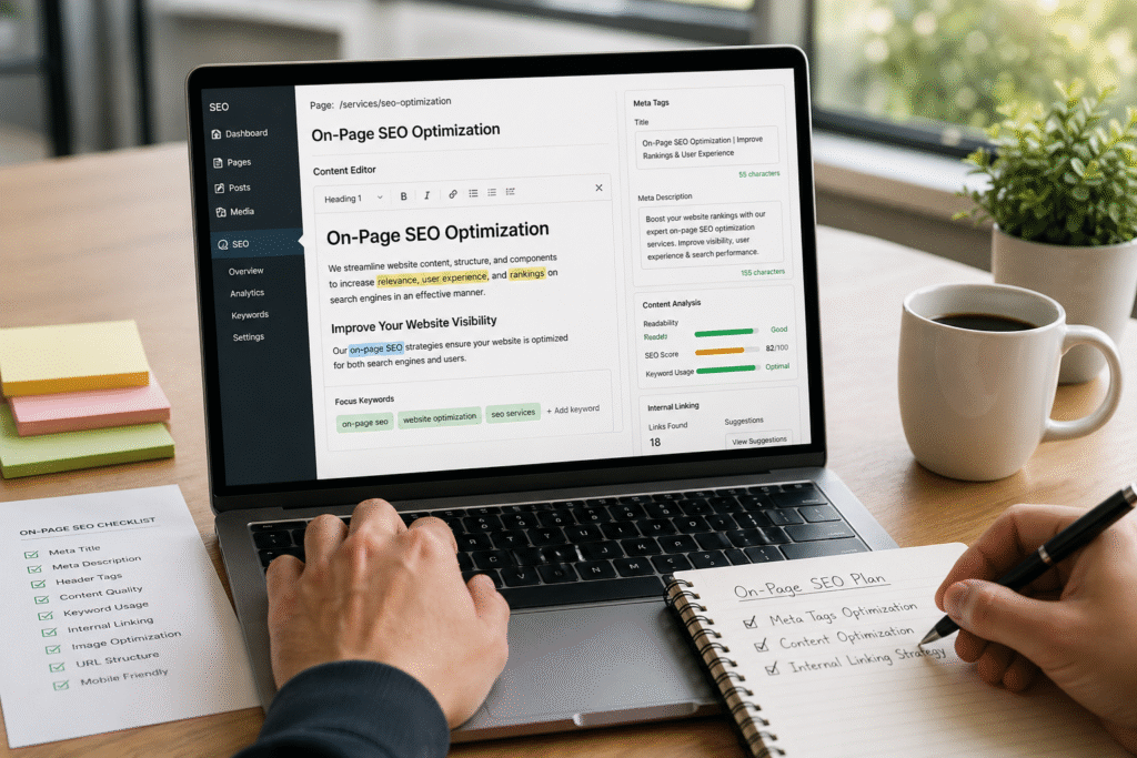
SEO Integration
We implement the best principles of SEO to guarantee an improved ranking, visibility and organic traffic increase.
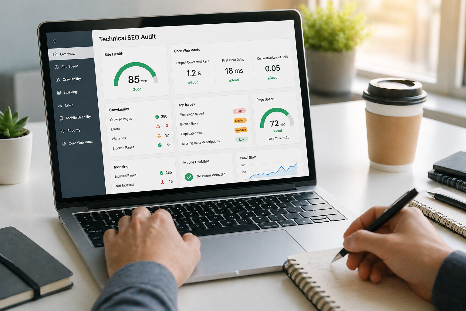
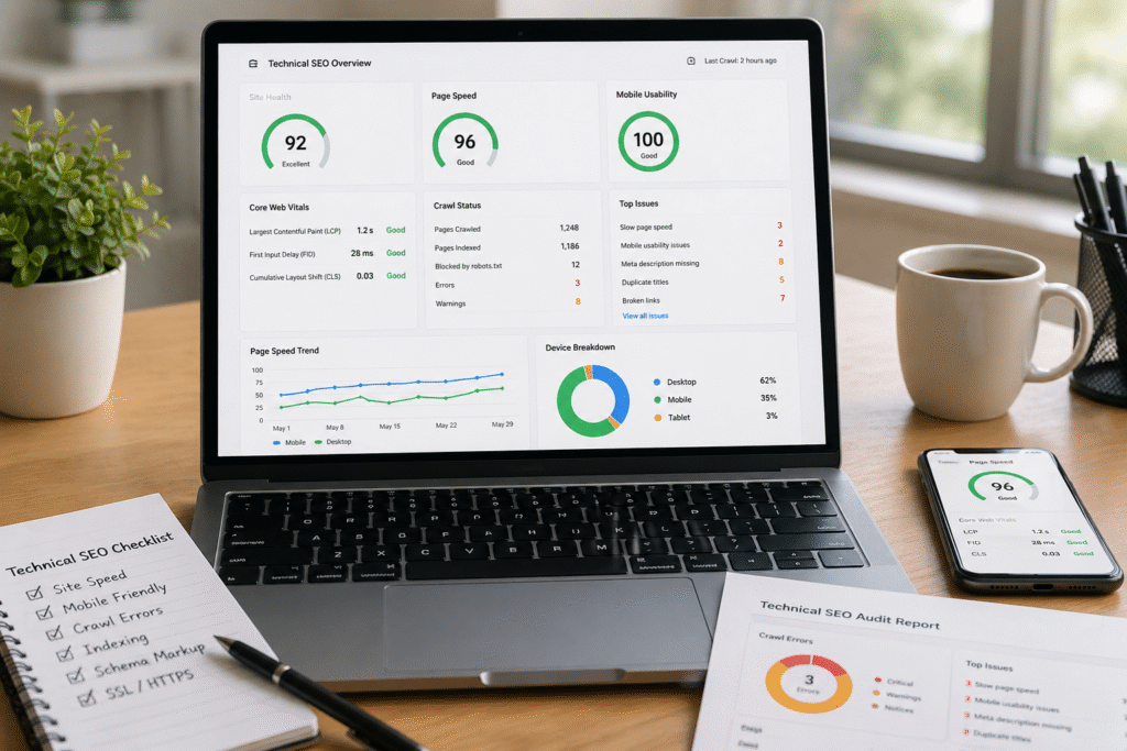
Continuous Testing
Periodic testing guarantees a perfect output across devices, browsers and screen size.

UX Optimization
Our attention is on the enhancement of user journeys to optimize engagements and conversions.

Global Client Reach
Providing scalable responsive design services across various industries across the globe.

Multi-Device Optimization
Global compatibility across desktops, smartphones and tablets.

Localized Design Approach
The region-specific behavior and preference of users.

High Performance Standards
To be fast and efficient in global markets.

Industry-Specific Solutions
Bespoke designs based on various industry and business requirements.

Continuous Global Support
Bringing in continuing effects and updates to international clients.


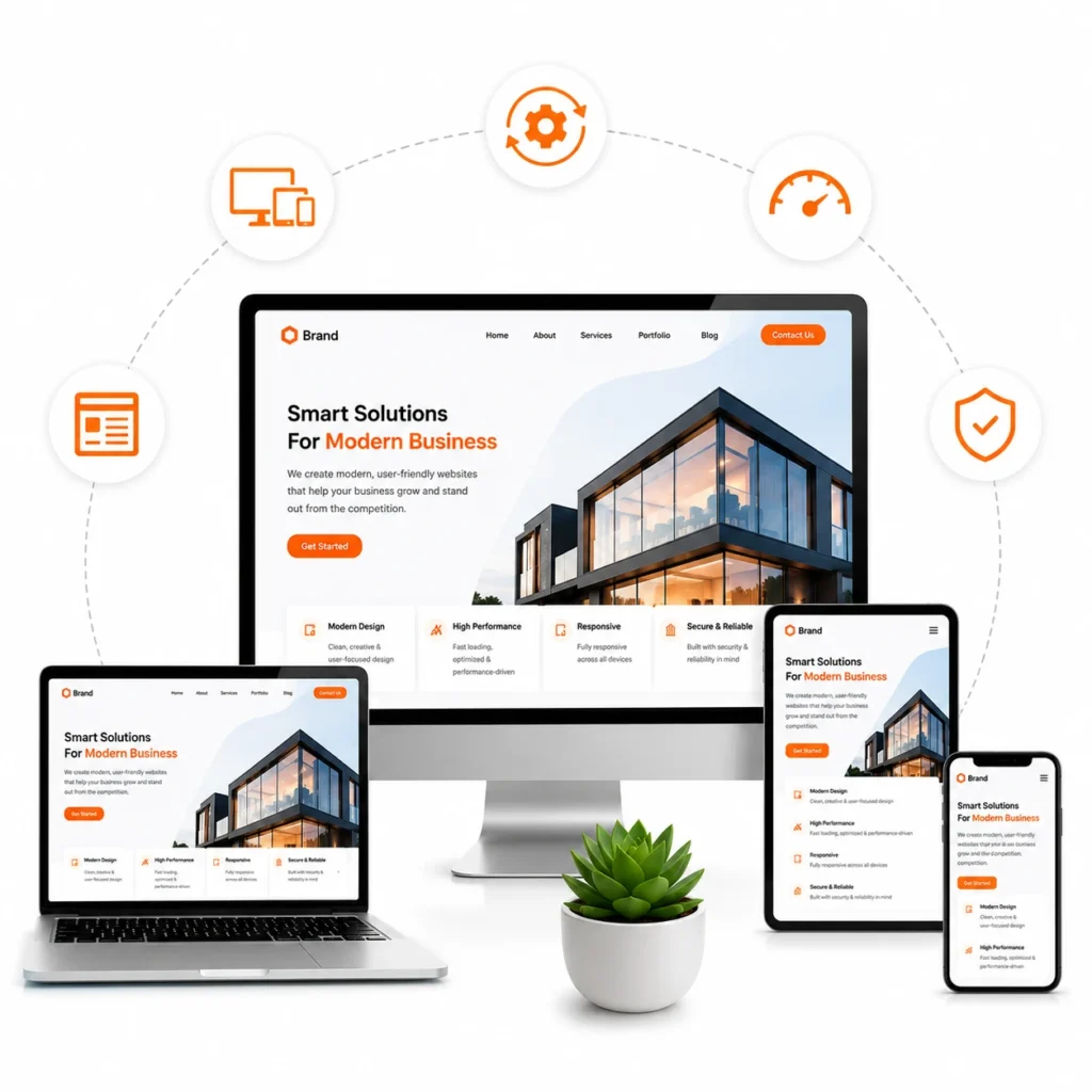
E-Commerce

Real Estate

Blogging

Support

Food & Beverage

School

Dentist

Production line

Law

Hospital
Working with 360 Digital Idea has been a game-changer for our app growth. Their team understands performance marketing deeply and helped us significantly increase installs while reducing our acquisition cost. Highly professional and result-oriented approach.

— Kunal Mehta


